How Bad Will It Be If We Hit the Debt Ceiling?
Paul Krugman
August 19, 2017
The odds of a self-inflicted US debt crisis now look pretty good: hard-line Republicans are eager to hold the economy hostage, Democrats are in no mood to make concessions, and Trump is both spiteful and ignorant. So it looks fairly likely that by October or so there will come a day when the U.S. government stops paying some of its bills, including interest on debt.
How bad will that be? The truth is that we don’t know; but it may be helpful to talk about *why* we don’t know.
Until now, US debt has played a special role in the world economy, because it is — or was — the ultimate safe asset, the thing people can use to secure transactions with no questions about it retaining its value. In a way, the dollar is to other moneys as money is to other assets, and US dollar debt is the form in which dollars are held with ultimate safety.
Taking away that role could be very nasty. One prominent interpretation of the 2008 financial crisis is that it was a “safe asset shortage“, pushing safe real interest rates to negative territories:
When people realized that those AAA securities engineered from subprime loans weren’t the real thing, they scrambled into an inadequate supply of trill safe stuff. Deprive them of dollar debts as safe assets, and terrible things could happen.
The question then becomes whether an interruption in payments would really knock out the special role of U.S. debt.
Suppose that everyone expected normal payments to resume, with back interest, in a couple of weeks. In that case, even a slight discount on, say, Treasury bills would make them a very good investment — so speculators would basically step in and support the value of U.S. debt despite temporary default. In that case default might not be that big a deal.
The big problem would come if investors see the default as more than a temporary glitch — if they see it as a sign of enduring, critical dysfunction in American governance. In that case they wouldn’t necessarily step in to buy our debt, and their confidence in the whole economic edifice would take a severe hit.
August 04: Total Employment Increased by 209,00 in July, and the Unemployment Rate Was Little Changed at 4.3 Percent
Total nonfarm payroll employment increased by 209,000 in July, and the unemployment rate was little changed at 4.3 percent, the U.S. Bureau of Labor Statistics reported today. Employment increased in food services and drinking places, professional and business services, and health care. Read more
Which U.S. Administration is Fiscally Responsible?
Merih Uctum
July 31, 2017
Several times since 2010 the U.S. government has faced the possibility of hitting a debt ceiling, a situation where, if not raised, the U.S. Treasury is not able to borrow to pay its bills on expenditures that were voted and already incurred. Since the U.S. Congress ratifies the spending package, raising the debt ceiling to finance the spending has typically been automatic. But that was not the case in 2013 where the debt ceiling conflict culminated in a government shutdown.
We are fast approaching the next deadline when the government will hit yet another debt ceiling, now expected to be in October of this year. Overall, the U.S. government has a tradition of following responsible policies: as debt rises, the government reacts to it by reducing the primary deficit or generating a primary surplus, defined as tax revenues minus spending excluding debt service, a pattern that was repeated most drastically by the previous administration despite economic weakness.
In this post, we examine the reaction to rising public debt during each administration since the 1970s. We use both descriptive figures and evidence from an econometric study to show that the Republican charge against Democrats is unfounded. Since the early 1970s, Republican administrations have started their mandates with lower levels of debt and have bequeathed higher levels to the Democrats.
Debt and deficit since the 1970s
Although most talk in the media is about debt in nominal U.S. dollars, policy analysts look at the figure as it relates to the productive capacity of the economy and analyze it as a proportion of nominal gross domestic product (GDP). The idea is that as the economy expands, it can support a larger nominal amount of debt or deficit.
Figure 1 shows the time plots of the debt-to-GDP and the deficit-to-GDP ratios since the late 1960s. The light blue and pink areas represent Democratic and Republican administrations, respectively, and the dotted vertical lines denote the business cycles peaks and troughs as defined by the National Bureau of Economic Research. Looking at these trends leads to two observations: (i) By the beginning of 2013, the debt-to-GDP ratio (blue line) reached a level unprecedented since 1973, equaling levels attained only during the Great Depression of 1933. However, public debt by itself is simply the result of the cumulated deficit, which is a reflection of public policy and business cycles (red line). (ii) An inspection of the behavior of the deficit line shows that the recent debt explosion was caused by the spectacular increase in the deficit during the Great Recession that started under the Bush administration. By contrast, during the subsequent administration, the government reversed this negative trend by reducing the deficit before the impact of recession ended and continued doing so before the recovery was established.
Looking back, it is interesting to note that over this period Republican administrations started their mandate with low deficits and end with higher deficits. By contrast, Democratic administrations start with higher deficits and end with lower deficits.
Figure 1: US Public Debt and Deficit Ratios
We can dig deeper into these figures by examining the two components of the deficit (Figure 2), outlays (red line) and revenues (green line), along with the primary deficit (blue line). The primary deficit follows closely the total deficit in Figure 1. It has been mostly negative since the late 1960s but turned significantly positive during the Clinton Administration with a combination of decreased spending and increased revenues. During the Bush Administration, the two lines diverged, first because of tax cuts and increases in spending due to the expansion of Medicare, second because of the financing of two wars through borrowing, and finally because of the Great Recession. Under the Obama Administration, both lines begin to converge again.
Figure 2: US Primary Balance, Outlays, and Revenues (ratios to GDP)
Is the U.S. government fiscally responsible?
One way of verifying the solvency of government policies is to look at whether the government systematically reacts to debt accumulation by generating a primary surplus or reducing the primary deficit. We saw in Figure 2 that the primary deficit is often reduced. But is this a systematic policy or is it simply due to improving economic activity that raises tax revenues and cuts fiscal stabilizers? Using an econometric technique, we estimate a model of a government reaction to the buildup of debt and compare the government behavior between the two administrations. This technique yields an estimate of the impact of government policy on the deficits and debt apart from any effects of an improving economy.
Figure 3 illustrates what happens to primary balances over a ten-year period following a 1% increase in the Federal debt. We find that overall, the US government starts raising the surplus within a year (starred line), so the US debt is sustainable (left panel). However, the pattern of changes in the surplus differ dramatically between administrations with a Democratic President and Republican President. While the Democratic President Administration immediately starts generating a surplus and paying the debt back (middle panel), under the Republican President Administration the surplus rapidly vanishes and the government starts adding to federal debt (right panel). Changes in debt can be best seen in Figure 3 where the primary balances are cumulated (straight line). At the end of the eigth year, the Democratic President Administration reduces the debt/GDP ratio by more than the initial 1% increase, while the Republican President Administration reduces it only by 0.1%.
Figure 3 Response of the Primary Surplus to a 1% Increase in Debt (ratios to GDP)
Debt-ceiling crises and a dim picture in the future
The costs associated with a failure to raise the debt ceiling are multilayered and go well beyond the mere government shutdown. In addition to the economic cost, successive debt-ceiling crises create a much more harmful uncertainty about the ability of the U.S. government to honor its commitments. This can affect its credit standing, as happened in 2012 when the U.S. AAA rating was downgraded and can hurt the dollar’s international reserve currency status. The dollar has enjoyed an unchallenged supremacy, which lowers U.S. borrowing costs by 0.8 to 1 percent. The Government Accountability Office estimated that the probability of default increased the government’s borrowing cost by 0.5 percent in the last crisis in 2011. In the long term, if the reputation of the U.S. economy is damaged, this could result in a permanently higher cost of borrowing and bigger deficit and debt.
However, both an aging population and rising interest rates put greater pressure on the deficit in the next 30 years. The Congressional Budget Office predicts that by 2047 the deficit will grow back to 9.8 percent of GDP. Discretionary spending (education, welfare, infrastructure, etc.), will amount to only 7.6 percent of GDP or a quarter of total federal government spending. Cutting discretionary spending as proposed by the Republican administrations not only slows down the economy and fails to put a dent into the deficit but as the European experience has shown, it can exacerbate budget problems during a slowdown by reducing revenues. This forecast into the future clearly calls for a national discussion about our social welfare priorities if we are to build a fiscally sustainable future.
Tech. Note: Which U.S. Administration is Fiscally Responsible?
Merih Uctum
July 31, 2017
Model
We conduct a time series analysis of the government reaction function using impulse response of the primary surplus/GDP ratio to an increase in debt/GDP ratio. This is one of the metrics used in the fiscal policy literature to measure the sustainability of the public finances. First developed by Bohn (1995), it consists in testing whether the government generates a primary surplus when debt/GDP increases over time in order to reduce it (1) st = α + Βbt-1 + γgt + et, where et~i.i.d. Where s, b and g are the share of primary surplus to GDP, the share of government debt to GDP, output gap, respectively. Primary surplus is defined as government tax revenues net of government spending, and it is equal to government deficit excluding the debt service component. Output gap is deviation of real GDP from its potential. Sustainability requires Β>0: as debt accumulates, the government has to generate a primary surplus. It can do this either by reducing the spending or increasing taxes or both. This is a partial equilibrium model that ignores the secondary effects of a change in debt and deficit on interest rates and the feedback to the government budget. The impact of business cycles is proxied by the variable gap. When GDP rises above its potential, primary surplus is expected to rise, γ>0. In order to introduce the political economy dimension in our analysis we include two multiplicative dummy variables on the coefficients of debt/GDP and output gap. DUMD represents the years with a Democratic President Administration (DP Administration) and DUMR = 1 – DUMD the years with a Republican President Administration (RP Administration). The model then becomes: (2) st = α0 + Β1DUMDbt-1 + Β2(1-DUMD)bt-1 + γ1DUMDgt + γ2(1-DUMD)gt + εt Data and Methodology All data come from Bureau of Economic Analysis except potential GDP that is from CBO and are from 1976 to 2017 and is annual. We divide the sample into two, democrats and republicans. Each subsample consists of the years during which the president from one of the parties is in power. covers the years 1966-68, 1977-1980, 1993-2000, 2009-2016 and the years 1969-76, 1981-92, 2001-08, 2017. We first test the stationarity of each variable. Tests reject non stationarity of all the first differenced series at the 5% confidence level (10% level for debt/GDP) suggesting that they are integrated of order one. To control for the impact of recessions on the estimation, we generate a dummy variable, recess, where we indicate with 1 each NBER recession period from peak to through and include it as an exogenous variable into the estimation equation. The VAR lag order selection criteria (Table 1, top panel), such as Likelihood Ratio, FPE, and Akaike information criteria indicate that 4 lags are optimal. Since for small samples AIC is more appropriate, we select 4 lags. Both the Trace test and the maximum Eigenvalue test in the Johansen Full Information Maximum Likelihood (FIML)test suggests one cointegrating equation for three model assumptions concerning deterministic trends (Table 1, lower panel). We select the more flexible model that allows for linear deterministic trend in the data and no intercept in the VAR, which is also supported by Schwarz criteria. Next, we proceed to build a Vector Error Correction Model (VECM) with 3 lags determined optimally as described above: (3) Δyt = -Πyt-1 + ∑i=1 ΦjΔyt-i + ui, where yt = [st, bt-1, gt]’, Π = (I-∑i=1Ai) and Φi = -∑i=1Aj = -A(L). We present below the impulse responses (IRs) for 10 periods. Results Table 2 presents the long-run cointegration relations under the two administrations. An increase in the debt/GDP ratio generates a primary surplus in the economy, irrespective of the political party in the administration, indicating that the US government is overall fiscally responsible and does not let debt accumulate without reacting to it. This suggests that the US debt is sustainable. As expected, an increase in output gap, i.e. a rise of GDP above its potential is associated with an increase in the primary surplus, under both administrations, spurred by higher tax revenues. However, quantitatively both estimates are starkly different under both administrations. When the debt/GDP ratio goes up, over the long run, DP Administrations generate a primary surplus that is twice larger than that of a RP Administration to pay the debt back, suggesting that unsustainability of debt is likely to become a bigger issue under the latter. Similarly, a positive output gap creates a larger surplus under a DP Administration than RP one. 
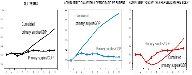
Do these results also hold in the short run? To answer this question, we now turn to impulse response functions. Table 3 (Figure 3 in the text) illustrates the response of the primary surplus to one percent change in the innovation of the lagged debt/GDP ratio. Here also the short-run results are consistent with the long-run results. When debt rises by 1% a democratic administration starts generating a surplus immediately following the year when debt rises and starts reducing it. It continues doing so every period and at the end of the 8th year, it accumulates 1.59% surplus, more than A Republican President Administration, however, allows the primary deficit to continue throughout the fourth year, turns the budget into a surplus only after a large lag and at the end of the eighth year accumulates a surplus of only 0.36%. In practice, once recovery takes place, with a virtuous cycle the primary surplus continues to rise independent of government’s reaction and reins in debt accumulation, as can be seen from the full-sample reaction function (Figure 3, left panel). Although the impact of the business cycle is controlled for, as mentioned above, this is a partial equilibrium model and ignores other channels through which debt and deficit interact with each other, such as change in the cost of borrowing, external and internal factors. Yet, it also isolates the reaction of the government under various administrations, which the raw data hint at in Figures 1 and 2. Table 1: Lag and Rank Order Selection Lag order Rank Order *Critical Values based on MacKinnon-Haug-Michelis (1999). Table 2 : Cointegrating Equations 5% t-statistics are in parentheses. Table 3 Impulse Response of primary surplus to a 1% change in debt/GDP [1] See Bohn 1995, and Uctum at al. 2006, Polito and Wickens 2012 for literature review and application. References Bohn, H. 1995. The sustainability of public deficits in a stochastic economy. Journal of Money, Credit and Banking 27, 257-271. Polito, V. and Wickens, M. 2012. A model based indicator of the fiscal stance. European Economic Review 56, 526-551. Uctum, M. Thurston, T. and Uctum, R. 2006. Public debt, the unit root hypothesis and structural breaks: a multi-country analysis.
LAG
log(L)
LR
FPE
AIC
SC
HQ
1
-855.5271
392.2858
3.65e+10
38.50118
39.69377*
38.94793
2
-810.0298
69.23498
1.56e+10
37.60999
39.79641
38.42904*
3
-793.6648
21.34567
2.51e+10
37.98543
41.16567
39.17676
4
-744.2902
53.66800*
1.08e+10*
36.92566*
41.09973
38.48929
Data Trend
None
None
Linear
Linear
Quadratic
Test Type
No Intercept, No Trend
Intercept,
No TrendIntercept,
No TrendIntercept, Trend
Intercept, Trend
Trace-Max
3
3
1
1
1
Eigenvalue
2
2
1
1
1
st
1.000000
DUMD*bt-1
-0.15706
[-4.67674]
(1-DUMD)*bt-1
-0.06647
[-1.99883]
DUMD*gt
-0.03307
[-12.3364]
(1-DUMD)*gt
-0.01415
[-4.25750]
Trend
0.085705
[2.08808]
C
-2.39962
Response Period
DP Administration
RP Administration
Level
Cumulative
Level
Cumulative
1
0.00
0.00
0.00
0.00
2
0.21
0.21
0.00
0.00
3
0.29
0.50
-0.17
-0.17
4
0.24
0.74
-0.07
-0.23
5
0.26
1.00
0.03
-0.20
6
0.26
1.26
0.09
-0.11
7
0.18
1.44
0.10
-0.01
8
0.16
1.59
0.10
0.09
9
0.14
1.74
0.12
0.21
10
0.13
1.87
0.15
0.36
July 28: U.S. GDP Rose 2.6 Percent in Q2, According to the BEA Advance Estimate
U.S. GDP, after its slump in the first half of last year, is back resting comfortably in its trend 2% real rate of growth path. Inventory, government spending, and other random quarterly events have created the illusion of more volatility than there really is. Real final sales of domestic product was up 2.6% Q/Q SAAR in Q2 compared to 2.7% in Q1. On a Y/Y basis, 2.2% in Q2 and Q1. On the buying side, real final sales to private domestic purchasers was up 2.7% Q/Q SAAR in Q2, a slight slowdown from the 3.1% pace in Q1. On a Y/Y basis – 2.8% in Q1 versus 2.9% in Q1. Read more
July 26: New York State GDP Expanded by 0.3 Percent in Q1
New York State GDP expanded by 0.3 percent at a seasonally adjusted annual rate in the first quarter of 2017. This growth rate roughly matches the 0.4 percent rate recorded in the fourth quarter of 2016, but is below the 1.4 percent GDP growth rate recorded nationwide in the first quarter of 2017. Read more
July 20: Total Employment in New York State in June Was up 1.7 Percent from a Year Ago
Total employment in New York State in June was up 1.7 percent from a year ago, supported by the 2.3 percent year-over-year job growth rate in New York City. The state and city job growth rates were both above the 1.5 year-over-year percent growth in jobs nationwide The state’s 4.5 percent unemployment rate in June roughly matched the 4.4 percent nationwide unemployment rate. Read more
A Finger Exercise on Hyperglobalization
Paul Krugman
July 11, 2017
The days when surging world trade was the big story seem like a long time ago. For one thing, trade has stopped surging, and seems to have plateaued. For another, we have faced more pressing issues, like financial crisis.
But I recently gave a presentation on trade issues, have been playing around with them again, and anyway want to take occasional breaks from the headlines. So I find myself trying to find simple ways to talk about “hyperglobalization,” the surge in trade from around 1990 to the eve of the Great Recession. None of the underlying ideas is new, but maybe some people will find the exposition helpful.
The idea here is to think about the effects of transport costs and other barriers to trade pretty much the same way trade economists have long thought about “effective protection.”
This concept was introduced mainly as a way to understand what was really happening in countries attempting import-substituting industrialization. The idea was something like this: consider what happens if a country places a tariff on car imports, but not on imports of auto parts. What it’s really protecting, then, is the activity of auto assembly, making it profitable even if costs are higher than they are abroad. And the extent to which those costs can be higher can easily be much bigger than the tariff rate.
Suppose, for example, that you put a 20% tariff on cars, but can import parts that account for half the value of an imported car. Then assembling cars becomes worth doing even if it costs 40% more in your country than in the potential exporter: a nominal 20% tariff becomes a 40% effective rate of protection.
Now let’s switch the story around, and talk about a good an emerging market might be able to export to an advanced economy. Let’s say that in the advanced country it costs 100 to produce this good, of which 50 is intermediate inputs and 50 assembly. The emerging market, we’ll assume, can’t produce the inputs, but could do the assembly using imported inputs. There are, however, transport costs – say 10% of the value of any goods shipped.
If we were talking only about trade in final goods, this would mean that the emerging market could export if its costs were 10% less – 91, in this case. But we’ve assumed that it can’t do the whole process. It can do the assembly, and will if its final costs including inputs are less than 91. But the inputs will cost 55 because of transport. And this means that to make exporting work it must have cost less than 91-55=36, compared with 50 in the advanced country.
That is, to overcome 10% transport costs this assembly operation must be 28% cheaper than in the advanced country.
But this in turn means that even a seemingly small decline in transport costs could have a large effect on the location of production, because it drastically reduces the production cost advantage emerging markets need to have. And it leads to an even more disproportionate effect on the volume of trade, because it leads to a sharp increase in shipments of intermediate goods as well as final goods. That is, we get a lot of “value chain” trade.
This, I think, is what happened after 1990, partly because of containerization, partly because of trade liberalization in developing countries. But it’s also looking more and more like a one-time thing.
July 7: Total Employment Increased, but the Unemployment Rate Ticked up to 4.4 Percent
Total nonfarm payroll employment increased by 222,000 in June, and the unemployment
rate was little changed at 4.4 percent, the U.S. Bureau of Labor Statistics reported
today. The unemployment rate ticked up as more Americans rejoined the workforce. Employment increased in health care, social assistance, financial activities,
and mining. Continue Reading